

A cleaner, more modern live chat widget
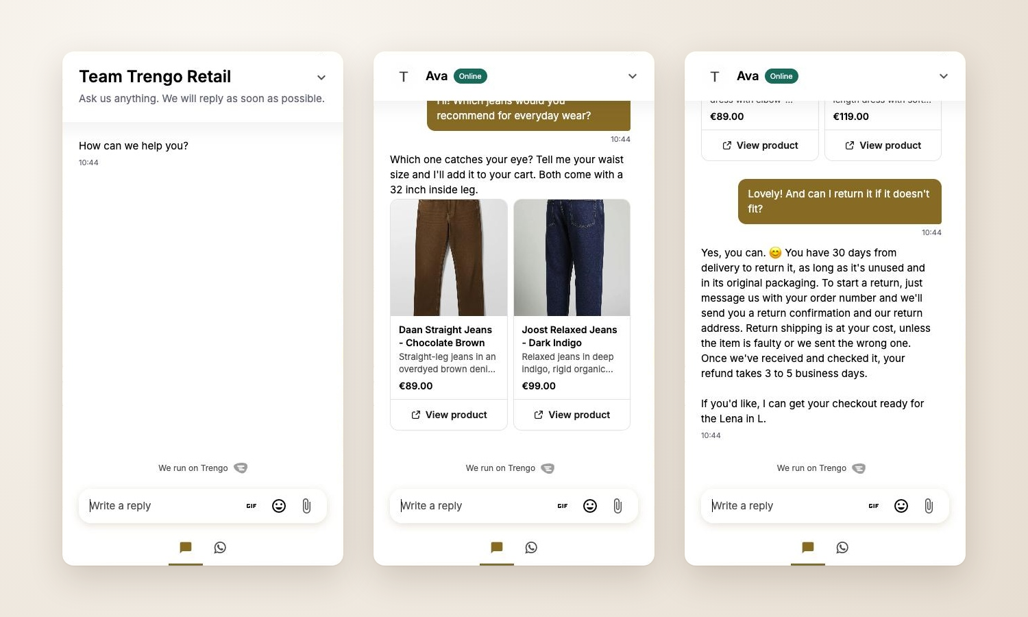
Your website live chat widget has a fresh look. It is cleaner, gives more room to the conversation, and feels closer to the messaging apps your customers use every day.
The update is live for every website widget. You don't need to change anything, and your brand color stays the same.
What's new
More room for the chat: once an agent joins, the header gets smaller. The agent's photo, name and "Online" label sit in one row.
Easier to read replies: agent replies sit on a clean white background and use the full width, like modern AI chats. Your visitors' messages keep a bubble in your brand color.
A calmer layout: no avatars next to every message, and smaller timestamps that show once per group of messages.
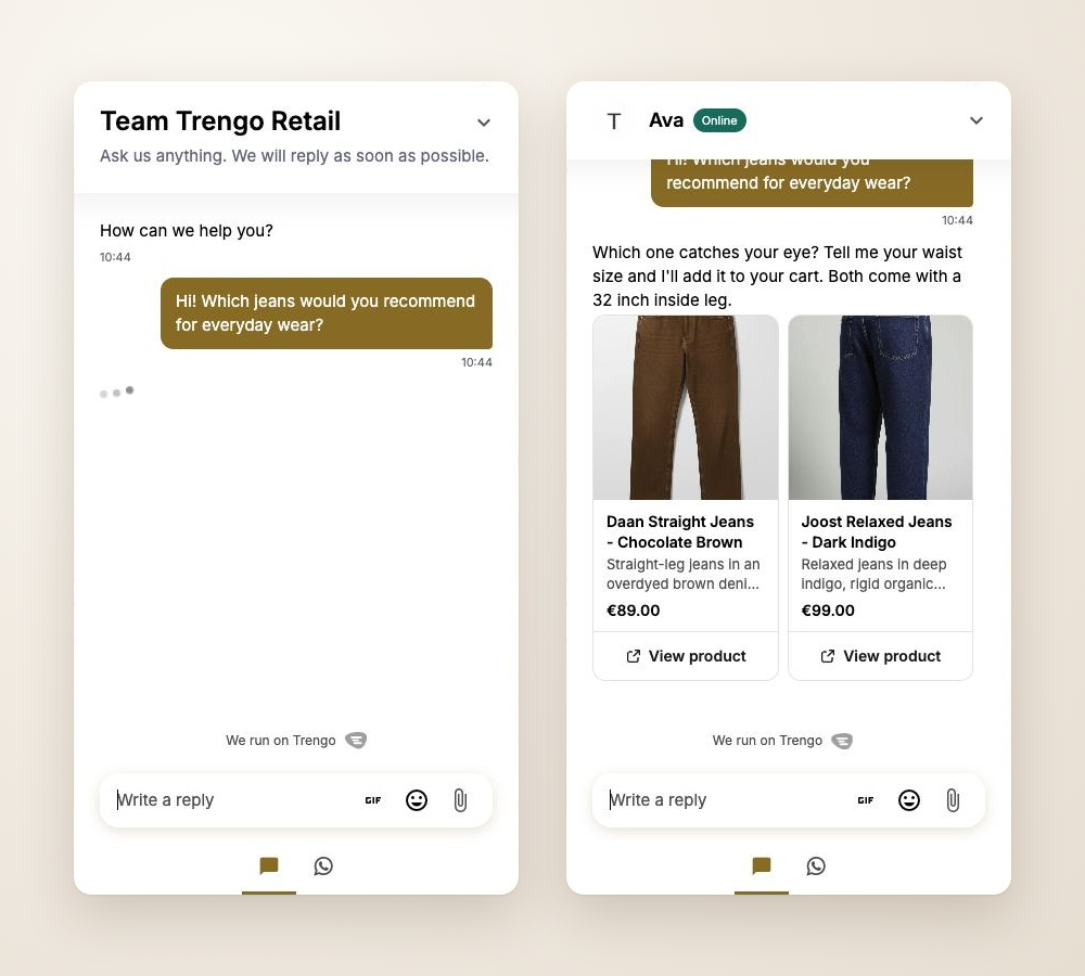
Product cards side by side: two product cards now fit next to each other, with no scrolling.
New typing indicator: soft grey dots show that a reply is on its way.
Smooth motion: the chat and new messages appear with a short, gentle animation. Visitors who turn on "reduce motion" on their device only see a simple fade.
Why this matters
Your customers see more of the conversation at once, and answers are easier to read. That helps them get what they need faster.